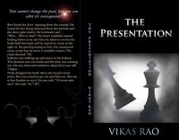
...There's a gem of a story trying to get out here, but it needs better formatting, proofing, and frankly an editor...
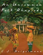
Set in India by an Indian author, this is an obvious labour of love which makes this review a hard one to write.
We review for readers, not authors.
This book is very hard to read, but that is mainly through issues with formatting and proofing. While it has the seeds of a good story, the layout issues make it almost impossible to follow.
Chapters do not always begin on a new page, and there are huge gaps in the text between paragraphs (loc 313) or even on the same line (loc 334). There are some punctuation issues (missing speechmarks around loc 56, confusion of it’s and its).Double quotes are used for speech but also for quotes inside speech, and commas are missing at the end of speech, inside the tags. In places it can be hard to follow as the text moves directly from present day to flashback with only a standard paragraph and no scene break markers. As flashbacks and reconstructions are a major narrative issue this is a problem.
There are a few typos, but they aren’t errors that a spell check would pick up e.g. “Starting right at you” instead of “staring right at you”. (loc 80)
In some places the phrasing is strange, but the meaning is clear enough e.g. “were not ireful to each other” loc 134.
There are a few plot issues that left me confused. Early on the students state the man pleaded guilty for a lesser sentence. However on 942 it states that is guilty the sentence was automatically death. Also 7:23 to 7:45 is twenty-two minutes not twelve (first mentioned on loc 68). This error persists throughout the story, which makes the reconstruction jarring.
The style is very dry, although the idea is unusual and the setting well-realised. There’s a gem of a story trying to get out here, but it needs better formatting, proofing, and frankly an editor.
I don’t think I can suggest an audience for it just because of the significant formatting issues – I can’t recommend a book I had to fight to formatting to finish. Potentially it would be law students and mystery buffs.
It gets a two. And I wish I could have given it more.
Rating: 2Reviewed by
Reviewed on: 2016-04-02
Review Policy: No compensation is received for reviews. View our Review Policy here.
